How do I use Account Summary reports?
In addition to the Overview Summary report, Banktivity provides ready-made reports to summarize the data in each of your accounts. To view an Account Summary report, select an account in the sidebar, then click "Summary" above the account register or choose Account > Show Summary. The contents of the report vary depending on the type of account you selected.Interpret the summary report for checking, savings, money market, cash, asset, liability, and line of credit accounts
Account Balance
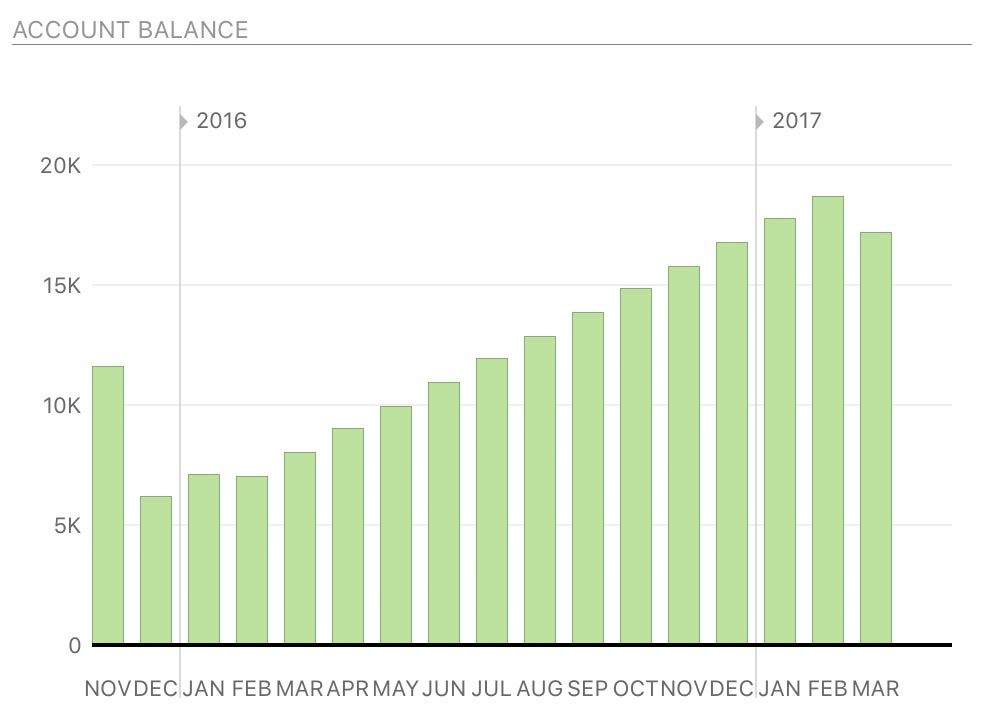
At the top left of this report is the monthly balance of the account shown as a bar chart. Each bar indicates the value of the account on the last day of the month in question. Hover the mouse over a bar to view the balance it represents. The number of months displayed will vary depending on the width of the main window. Click on any bar to view an Income & Expense report for that month.
Summary
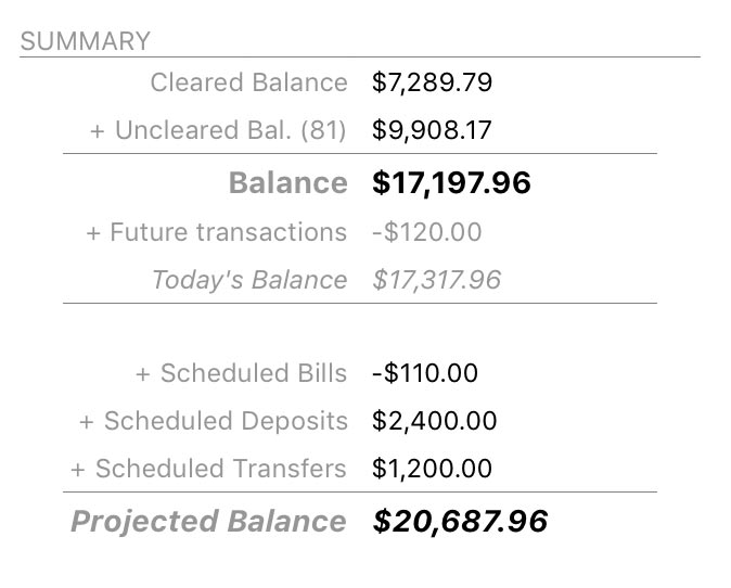
The account summary to the right of the bar chart displays the total value of cleared and uncleared transactions as well as the current account balance. Below that are the total values of upcoming scheduled bills, deposits, and transfers (based on the date range specified in the next section), along with the account's projected balance after the schedules have been posted.
Upcoming
Below the bar chart is a summary of upcoming scheduled transactions in the account, including deposits, withdrawals, and transfers. Arrows next to the dates indicate whether money is moving in (right arrow), moving out (left arrow), or transferring between accounts (double arrow). Click any item to view the main scheduled transactions list and edit your schedules.

The default date range for this summary is the current month, but you can click the gear button at the top right to choose a different timeframe. The projected balance in the summary table above will update accordingly.
Spending
To the right of the scheduled transactions section you will see a bar graph showing totals for your top spending categories during the last month. Percentages are shown in reference to the other categories displayed on the chart. Click the gear button at the top of the chart to change the date range or exclude specific categories.
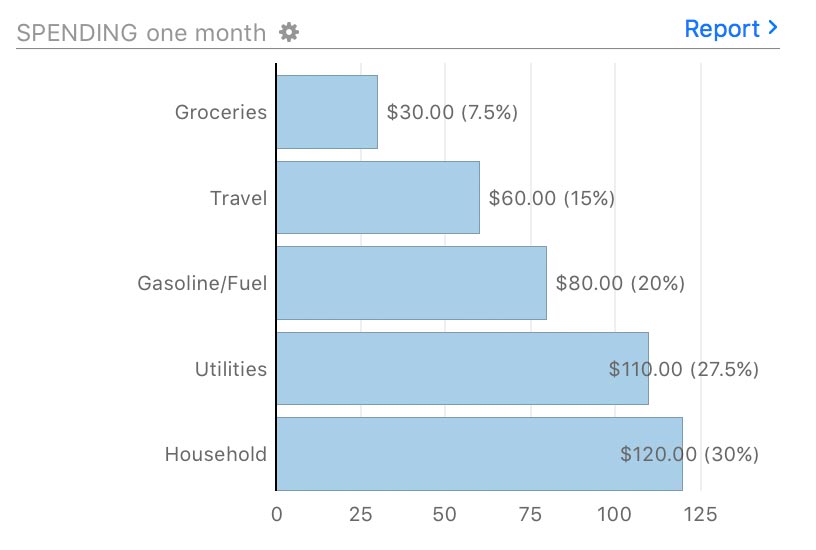
Click on any bar to view a Category Detail report for the corresponding category, or click "Report" at the top right to view an Income & Expense report for the current year.
Tag Spending
Similar to the spending chart above, this section shows a bar graph with totals for your top spending in different tags during the last month. Percentages are shown in reference to the other tags displayed on the chart. Click the gear button at the top of the chart to change the date range.
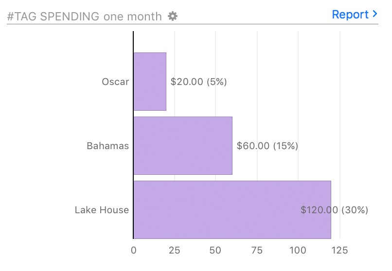
Click on any bar to see a Tag Detail report for the corresponding tag, or click "Report" at the top right to view a Tag Spending report for the current year.
Interpret the summary report for credit card accounts
High and Low Balance
At the top left of this report are the high and low balances of the account as a bar chart. For each month, the highest balance (most debt) is shown in a light shade of reddish pink and the lowest balance of the month (least amount of debt) is shown in red. The number of months displayed will vary depending on the width of the main window. Hover the mouse over a bar to view the exact amounts represented.
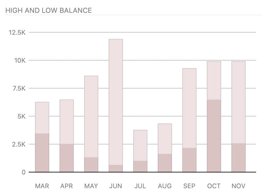
Click on any bar to view an Income & Expense report for that month.
Summary
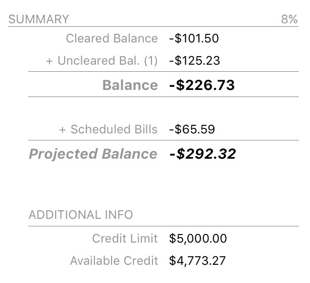
The account summary to the right of the bar chart displays the total value of cleared and uncleared transactions. Below that are the total values of upcoming scheduled bills, deposits, and transfers (based on the date range specified in the next section), along with the account's projected balance after the schedules have been posted. Under "Additional Info" is shown your credit limit (which you can edit by double-clicking the account in the sidebar) and your available credit (equal to the difference between the credit limit and the account balance). The percent value at the top right is the card's interest rate, which you can edit by double-clicking the account in the sidebar.
Upcoming
Below the bar chart is a summary of upcoming scheduled transactions in the account, including deposits, withdrawals, and transfers. Arrows next to the dates indicate whether money is moving in (right arrow), moving out (left arrow), or transferring between accounts (double arrow). Click any item to view the main scheduled transactions list and edit your schedules.

The default date range for this summary is the current month, but you can click the gear button at the top right to choose a different timeframe. The projected balance in the summary table above will update accordingly.
Spending
To the right of the scheduled transactions section you will see a bar graph showing totals for your top spending categories during the last month. Percentages are shown in reference to the other categories displayed on the chart. Click the gear button at the top of the chart to change the date range or exclude specific categories.
Click on any bar to view a Category Detail report for the corresponding category, or click "Report" at the top right to view an Income & Expense report for the current year.
Tag Spending
Similar to the spending chart above, this section shows a bar graph with totals for your top spending in different tags during the last month. Percentages are shown in reference to the other tags displayed on the chart. Click the gear button at the top of the chart to change the date range.

Click on any bar to see a Tag Detail report for the corresponding tag, or click "Report" at the top right to view a Tag Spending report for the current year.
Interpret the summary report for investment and 401k accounts
Market and cash value
At the top left of this report is a bar chart depicting the total value of the investment account over time. Each bar covers one month and represents the account value at the end of that month. The number of months displayed will vary depending on the width of the main window.
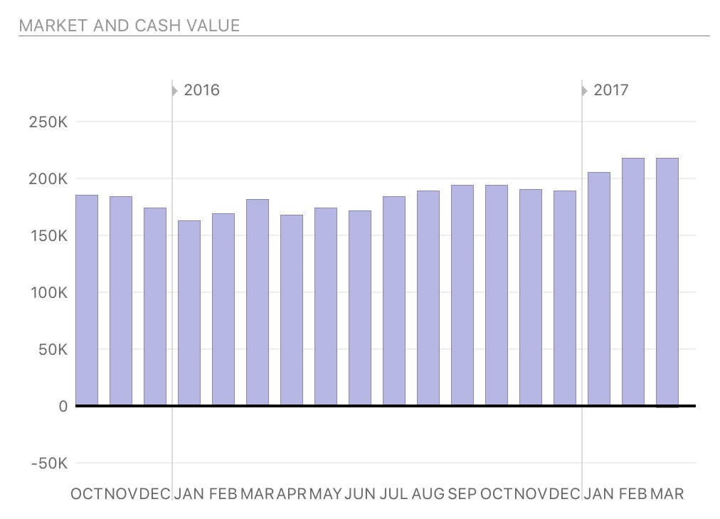
Assets are drawn above the horizontal axis and consist of cash (unallocated money in the account, in purple) and securities (market value of shares you hold, in green). Liabilities are drawn below the axis and consist of cash (money overdrawn from the account, in dark pink) and securities (market value of short sales, in light pink).
Hover the mouse over a bar to view the value of security assets, cash assets, security liabilities, and cash liabilities at the end of that month. Click on a bar to view an Investment Summary report for the month.
Summary
The account summary to the right of the bar chart displays the value of unallocated cash in the account, the market value of all holdings in the account, and the total value. Below that is the internal rate of return (IRR), an annualized rate equal to the interest rate on a bank account that would give you the same total return on your investment. Finally, year-to-date (YTD) deposits shows the total value of all contributions made to the account during the current year, through cash deposits, cash transfers, or security purchases that use "Transfer" distribution.
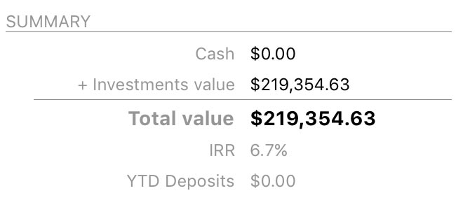
If the internal rate of return exceeds 1000%, Banktivity does not report it. Although it may indicate extremely rapid growth or loss within a very short time frame, such a high rate is much more likely to be the result of an error in the transaction records.
Holdings
Below the bar chart is a list of securities you currently hold in the account, sorted alphabetically by symbol. Each security shows its name and symbol followed by its current price, the number of shares currently held, cost basis (amount paid for the shares), estimated market value, unrealized gain or loss relative to the cost basis (expressed both as an amount and as a percentage), and internal rate of return.

Click on any security to view a Security Detail report for that item, or click "Report" at the top right to view an Investment Summary report for the account.
Value by type and risk
These are bar charts depicting the security shares you currently hold. The chart on the left shows a breakdown of the shares by security type; the chart on the right shows a breakdown by risk level. Each bar represents the total market value of the shares of a particular type or risk, and the bars are drawn proportionally so that you can see which shares are worth more. Unallocated cash in the account is also included for comparison.

Hover the mouse over a bar to view the type or risk classification, market value of the shares, and percentage relative to the other classifications. Click on any bar in the chart to view a Security Detail report for the corresponding securities.
Interpret the summary report for loan accounts
Amortization chart
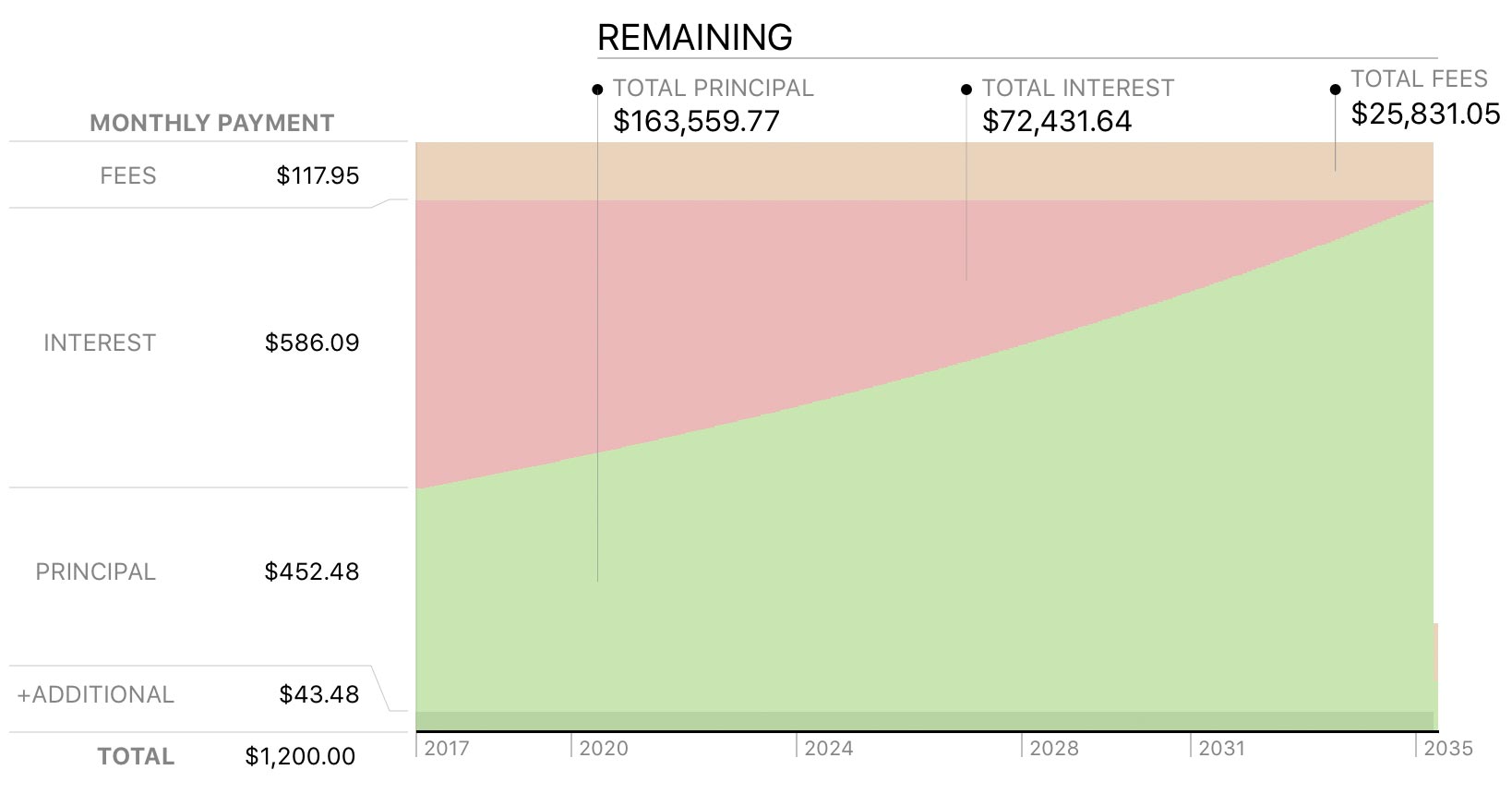
At the top of this report is an area chart depicting all remaining loan payments. Time is plotted along the x axis while the y axis is used to show amortization. Each payment is divided into principal (light green), interest (red), fees (orange), and additional principal (dark green). The values shown on the y axis indicate the amount of each of these parts of the next payment that is due, along with the total payment amount. Shown at the top of the chart are the total principal, interest, and fees that remain to be paid over the life of the loan.
Payment schedule
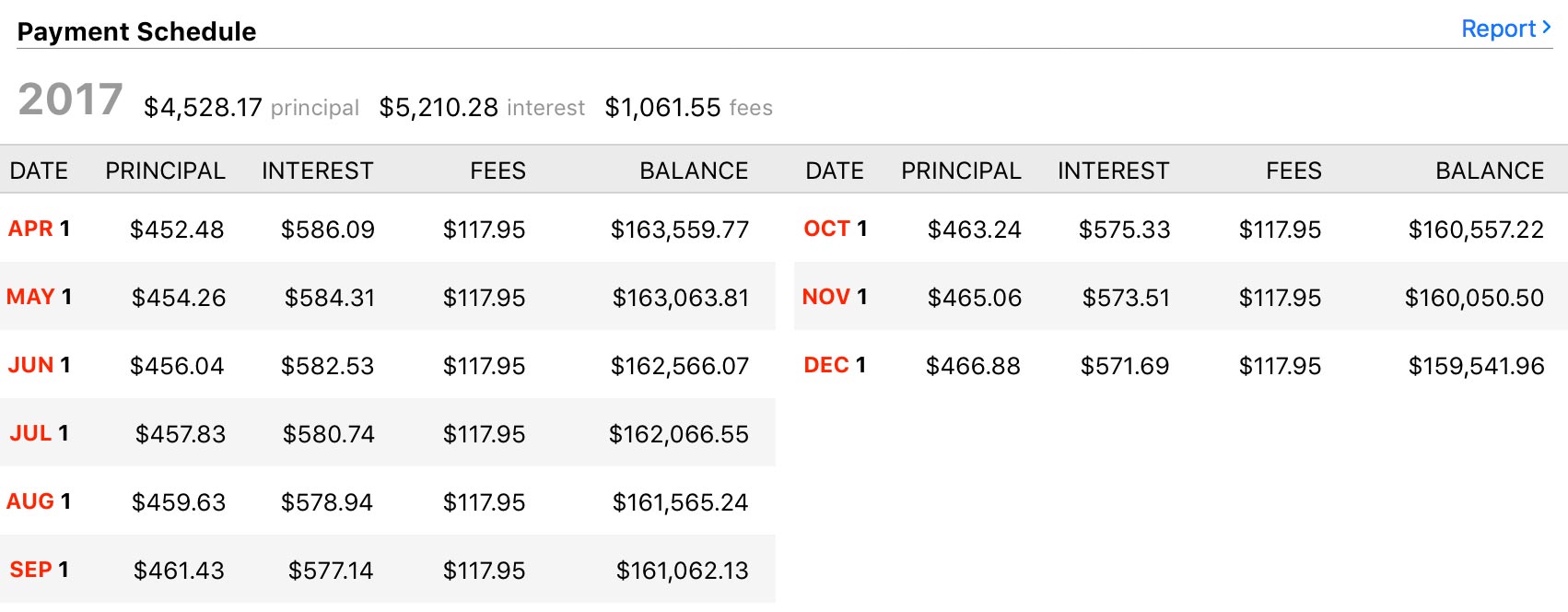
Below the chart is an amortization table showing remaining loan payments grouped by year. Each payment shows the date on which it is due; the amount of principal, interest, and fees covered by the payment; and the resulting loan balance after the payment is processed. The total amount of principal, interest, and fees paid each year are also shown. To adjust the payment schedule, interest rate, and other loan features, choose Account > Edit Loan Information.
Print, save, and export report data
Information displayed in the Account Summaries can be printed, saved, and exported just like any other report. For more information about using these features, see About Reports.
