How do I use the Income & Expense report?
This report is used to analyze the cash flows in and out of your accounts based on the categories assigned to your transactions. It is the easiest way to track trends in specific categories and to see if you are earning more than you spend in given periods of time. This report includes a pie chart that shows breakdowns of your income and expenses by category, a bar chart that shows your spending over time (cash flow), and tables of income and spending totals by category.
Interpret the Income and Spending report
The report's type and name are shown at the top left. The date range (or ranges if you chose to include a comparison period) used for the report is at the top right. Click the arrow buttons to the left or right of the date to move backward or forward in time. If using a comparison period, you can use the second set of arrows to change that date range independently.
Category pie chart
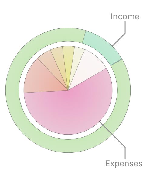
This pie chart depicts your expenses and income over the period of time covered by the report. Income is represented in the outer ring; expenses are displayed in the inner circle. Each pie slice represents the total value of a particular category or transfer associated with a particular account. The slices are drawn proportionally so that you can see which items comprise a larger portion of your cash flow.
Hover the mouse over any slice to see its amount and percentage relative to the other slices in the chart. Click on any pie slice to drill down and view a Category Detail report for that item (see below).
Timeline bar chart
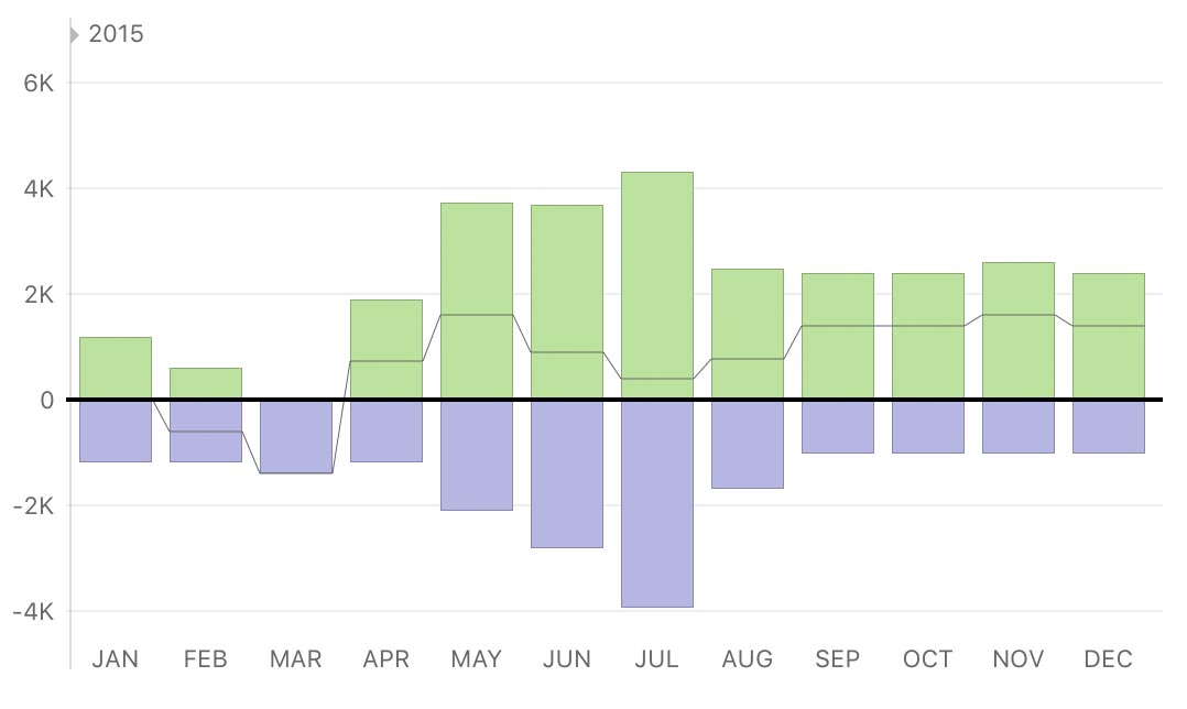
This is a bar chart depicting your cash flow over time. Each bar represents the total income and expenses recorded during a period within the report's full date range. Income for each interval is drawn above the horizontal axis; expenses are drawn below it. The gray line indicates the total combined income and expenses (net cash flow) for each period. If you are using a comparison period, two sets of bars will be shown at each interval. The light-colored bars on the left represent the comparison data.
Hover the mouse over a bar to view the time period it represents, income and expense amounts for that period, and the net cash flow value. Click on a bar to view an Income and Spending report restricted to that date range.
Income and spending summary tables
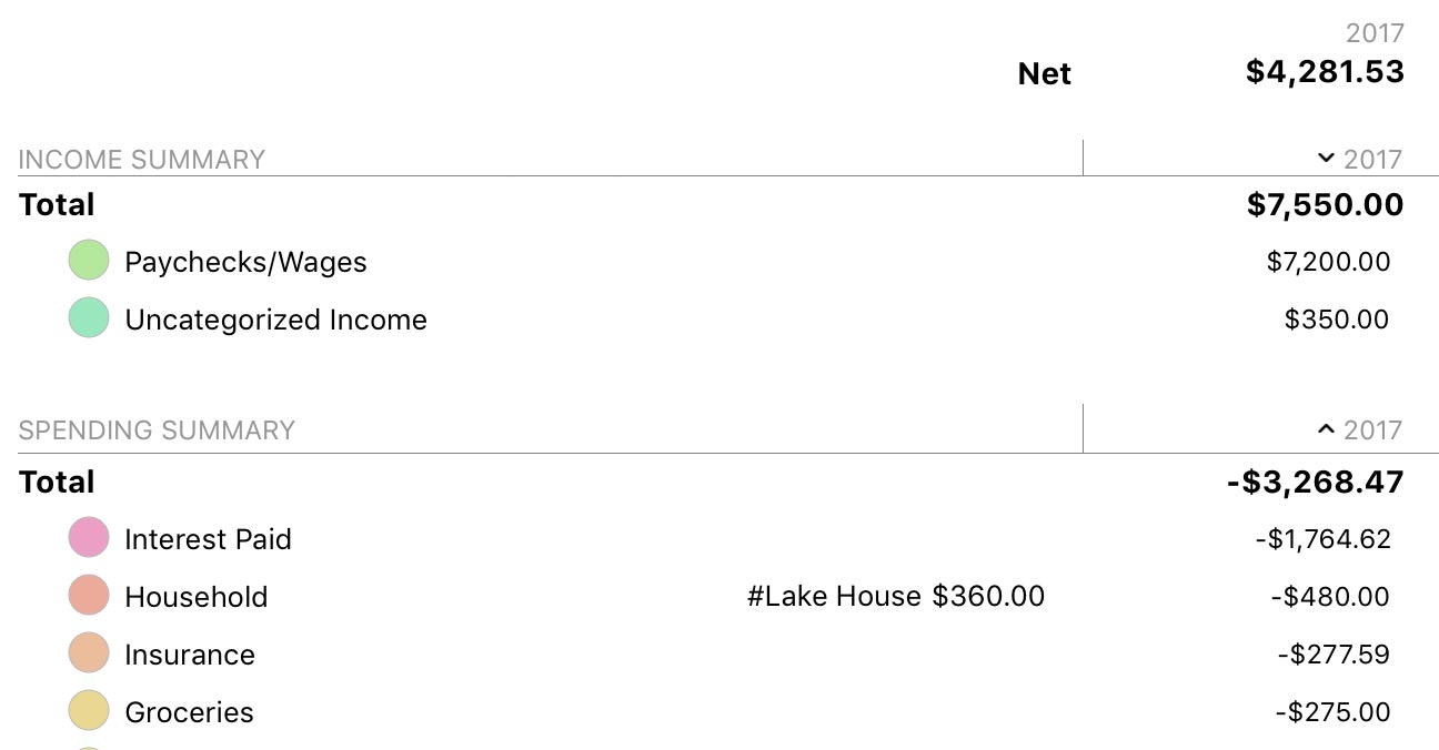
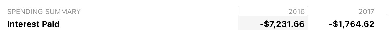
These tables summarize your income and expense categories over the date range covered by the report. The column on the left lists the category names, grouped according to their type. The color displayed with each category corresponds to its color in the pie chart above. Click the disclosure triangle to the left of any parent category to reveal its sub-categories, or Option-click to reveal all sub-categories at once. Click on any category or sub-category to drill down and view a Category Detail report for that item (see below).
To the right of each category are the totals for any tags that were used in conjunction with that category. Click on a tag to drill down and view a Tag Detail report for that item (see Report Types: Tag Spending).
The far right column shows the total for each category or group for the date range covered by the report. The total displayed at the top of the table is your net expenditure, also known as the "bottom line." If you are using a comparison period, two sets of totals are shown, one for each date range.
By default, the categories are sorted by amount in descending order. If you click any column header at the top of the table, you can sort by that column. Click the column header again to change the sort order.
Interpret the Category Detail report
This report provides detailed information about a specific category and any sub-categories it contains. The report's type and name (which is the name of the category by default) are shown at the top left. The date range (or ranges if you chose to include a comparison period) used for the report is at the top right. Click the arrow buttons to the left or right of the date to move backward or forward in time. If using a comparison period, you can use the second set of arrows to change that date range independently.
Timeline bar chart
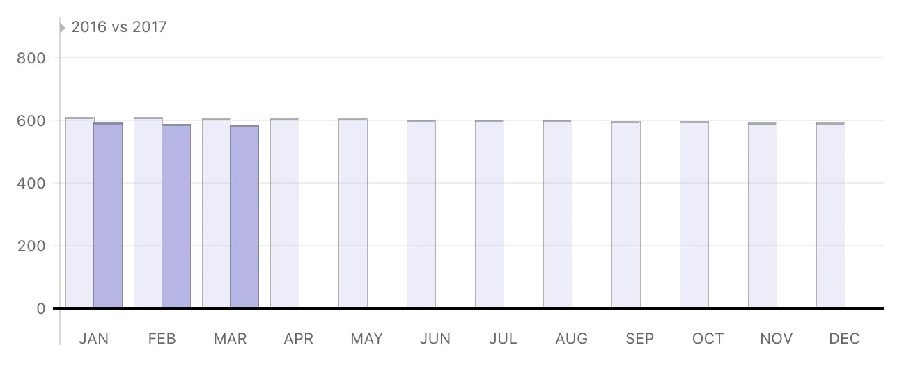
This is a bar chart depicting income or expenses in the category, based on its type, over time. Each bar represents the total amount recorded in that category during a period within the report's full date range. If you are using a comparison period, two sets of bars will be shown at each interval. The light-colored bars on the left represent the comparison data.
Hover the mouse over a bar to view the time period it represents, income and expense amounts for that period, and the net cash flow value. Click on a bar to view a Category Detail report restricted to that date range.
Income or spending summary table
This table summarizes income or spending in the category over the date range covered by the report. The column on the left displays the category name. If the category contains sub-categories, click the disclosure triangle to the left of the category name to reveal them. Click on any sub-category to view a Category Detail report for that item.
The right column shows the total for each category and sub-category for the date range covered by the report. If you are using a comparison period, two sets of totals are shown, one for each date range.
By default, the sub-categories are sorted by amount in descending order. If you click any column header at the top of the table, you can sort by that column. Click the column header again to change the sort order.
Top payees

This table shows payees used in conjunction with the category over the date range covered by the report. Each row shows the payee name, number of transactions to which the payee is assigned, and the total value of those transactions. The top five are shown automatically; click "Show More" to reveal the rest.
By default, payees are sorted by amount in descending order. If you click any column header at the top of the table, you can sort by that column. Click the column header again to change the sort order.
Click on a payee to drill down and view a Payee Detail report for that item. This report includes a list of transactions that include both the payee you clicked and the category from the previous report. You can edit a transaction by selecting it and pressing Enter on your keyboard. If you make changes and save them, the report will be updated automatically.
Transactions by account
![]()
This table lists transactions, grouped by account, that are assigned to the category within the date range covered by the report. You can edit a transaction by selecting it and pressing Enter on your keyboard. If you make changes and save them, the report will be updated automatically.
By default, the transaction table is sorted chronologically in descending order. If you click any column header at the top of the table, you can sort by that column. Click the column header again to change the sort order.
Learn more about reports
For more information about configuring report options, see Add a Report. For more information about printing, exporting, and otherwise managing reports, see About Reports.