How do I use the Net Worth report?
The Net Worth report type is used to determine the total value of all your accounts. Also known as wealth, net worth is calculated by taking the value of your assets (money you hold) and subtracting the value of your liabilities (money you owe). Cash you have in your accounts is included as well as any investments you hold.
Banktivity's Net Worth report includes a pie chart showing breakdowns of your assets and liabilities by account type, a bar graph describing your net worth over time, and a balance sheet that details your assets and liabilities on the end date of the report.
Interpret the Net Worth report
The report's type and name are shown at the top left. The date range (or ranges if you chose to include a comparison period) used for the report is at the top right. Click the arrow buttons to the left or right of the date to move backward or forward in time. If using a comparison period, you can use the second set of arrows to change that date range independently.
Assets and liabilities pie chart
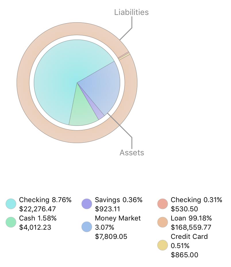
This chart depicts your assets and liabilities at a fixed point in time (the end date of the report). Assets (accounts with positive balances) are shown in the inner circle; liabilities (accounts with negative balances) are in the outer ring. Each pie slice represents the total value of the accounts of a particular type. The slices are drawn proportionally so that you can see which types of accounts are worth more.
Below the chart is a key that shows which colors correspond to which account types and the total value of each type. Hover the mouse over any slice to see its type, value, percentage relative to the other slices in the chart, and number of accounts represented by that type. Click on any pie slice to view a Net Worth report for the accounts it represents.
Timeline bar chart
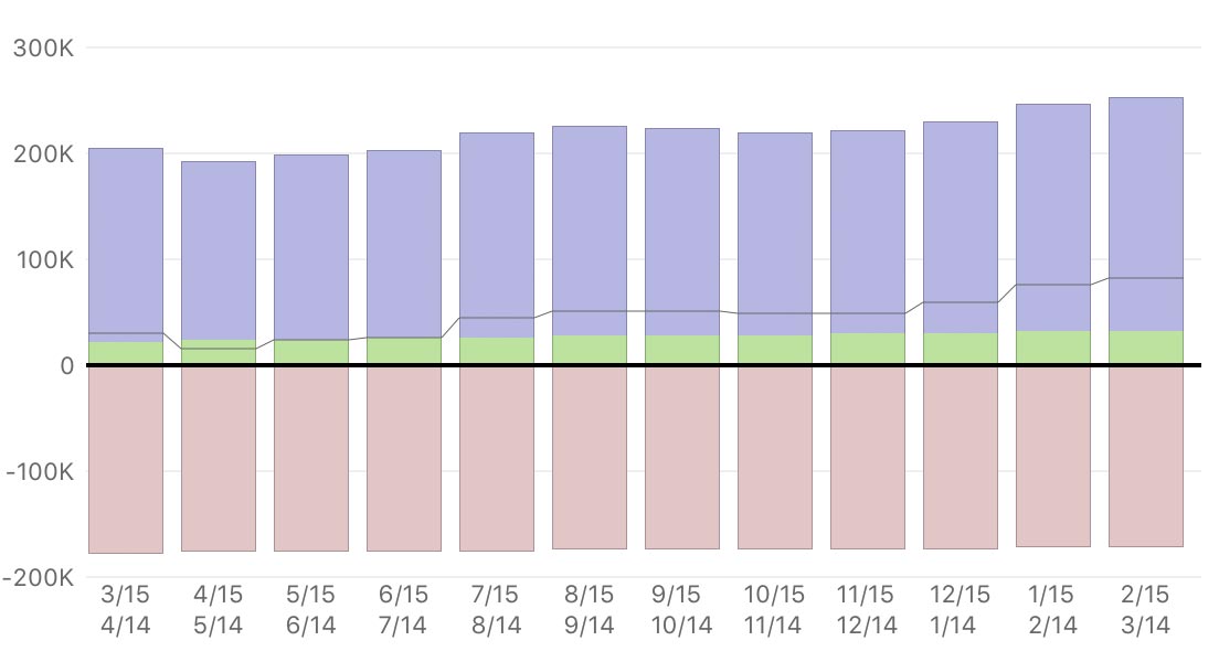
This is a bar chart depicting your net worth over the range of dates covered by the report. Each bar represents the total value of your accounts at a specific interval. Assets are drawn above the horizontal axis and consist of cash (money you have on hand, in purple) and securities (cost basis of shares you hold, in green). Liabilities are drawn below the axis and consist of cash (money you owe, in dark pink) and securities (cost basis of short sales, in light pink). The gray line indicates your net worth at each interval. If you are using a comparison period, two sets of bars will be shown at each interval. The light-colored bars on the left represent the comparison data.
Hover the mouse over a bar to view the time period it represents; the value of cash assets, security assets, cash liabilities, and security liabilities at the end of that period; and your net worth at the end of that period. Click on a bar to view a Net Worth report restricted to that date range.
Asset and liability tables
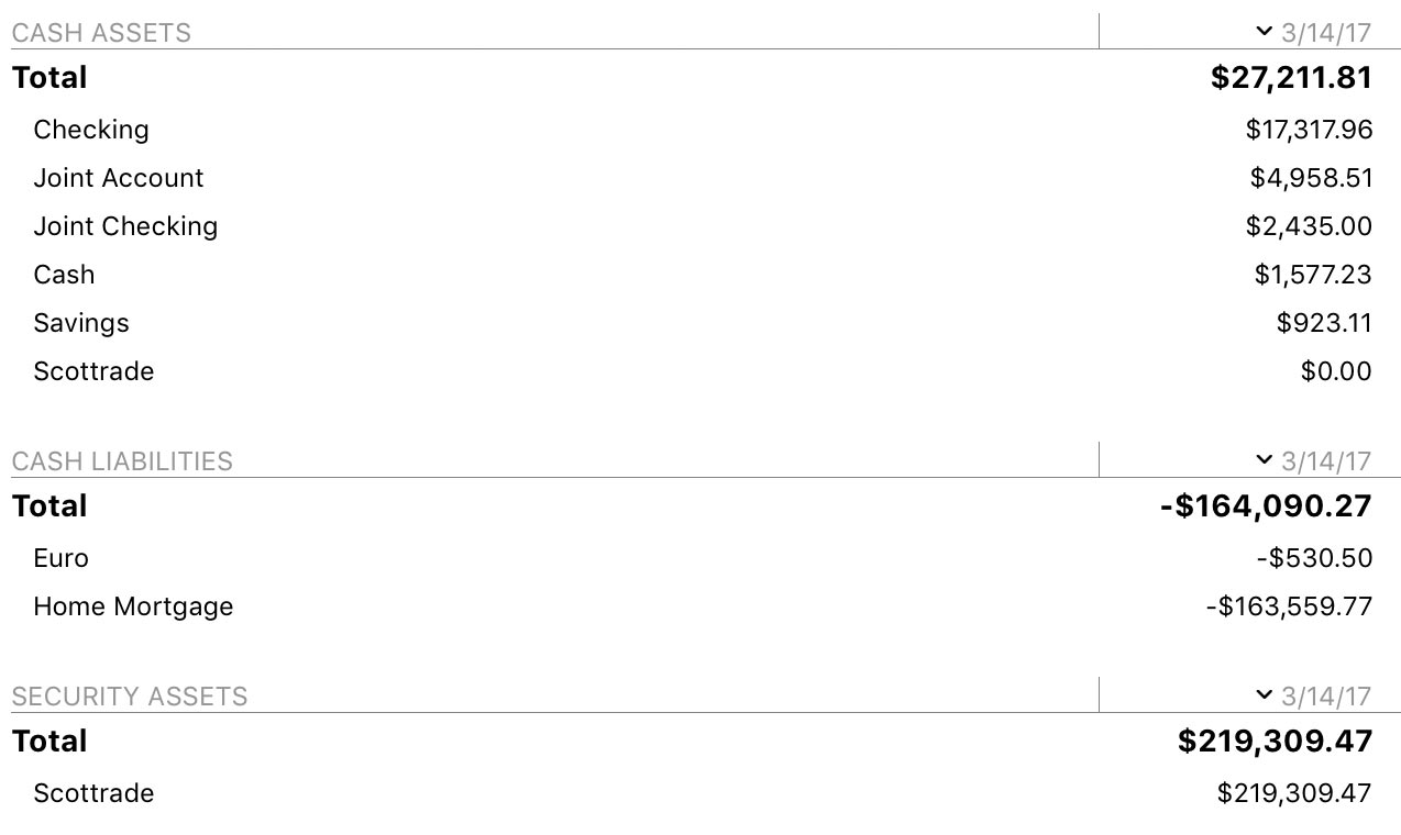
Immediately below the net worth bar chart is a table summarizing your total assets, total liabilities, and net worth on the end date of the report. Below that are tables detailing your cash assets, cash liabilities, security assets, and security liabilities by account. Account names are shown in the left column, and their values are shown to the right, with totals for each table shown at the top. If you are using a comparison period, two sets of totals are shown, one for each date range.
Investment and 401k accounts have their cash and security values counted separately. Securities use their market value and are classified according to whether they are held as long (asset) or short (liability) positions.
By default, the accounts are sorted by amount in descending order. If you click any column header at the top of a table, you can sort by that column. Click the column header again to change the sort order. Click on an account to view and edit its transaction register.
Learn more about reports
For more information about configuring report options, see Add a Report. For more information about printing, exporting, and otherwise managing reports, see About Reports.